An author website that gets one thing done.
Your book sends people to your website. The site has one job when they arrive: turn a curious reader into a speaking inquiry, a client conversation or a subscriber. Here are the pages it needs, what goes above the fold, a page-by-page template, patterns from real Scribe authors' sites, and a checklist to tear down your own.
What an author website is for
Most author websites are built like a scrapbook: a page for the book, a page of press, a blog that stopped in its third month, a photo gallery. Visitors look around and leave, because nothing on the site asks them to do anything.
Start from the other end. Who arrives at your site, and what do you want them to do next? For an expert with a nonfiction book, the answer is almost always one of three things.
| If your book is mainly for | The one action | What the visitor needs to see first |
|---|---|---|
| Getting booked to speak | An event planner sends a speaking inquiry | Your talk titles, who they are for, a short video or photo of you on stage, and a speaker sheet to download |
| Winning clients | A buyer books a conversation | The problem you solve, in their words, and how working with you starts |
| Reaching readers | A reader joins your email list | What they get by subscribing, and how often |
Pick one as the main action. The other two can appear, but lower down and smaller. A site that gives three equal buttons gets fewer clicks on all three, because the visitor has to decide what you want before they can decide whether they want it.
The test: show your home page to someone for five seconds, then hide it. Ask who the site is for and what it wants them to do. If they cannot answer both, the page is not finished.
The site is where the rest of your brand gets checked. A podcast host reads your bio, a client hears your name at dinner, a reader reaches the about the author page at the back of your book, and all of them type your name into a search bar. What they find should say the same thing your one-line promise says.
The five pages it needs
Five pages cover what most expert authors need. Add more only when people keep asking for something the five do not answer.
Home
Your promise, who you help, the book, and the one action. Short. Its job is to send people to the right next page.
About
A first-person bio of 200 to 400 words, the story of why you do this work, and your main headshot. The bio guide covers the first-person version; the bio builder drafts it from your facts.
Book
The cover, the subtitle, who the book is for, what readers will be able to do after reading it, two or three endorsements, and links to buy in every format. If you sell signed copies or bulk orders yourself, say so here.
The action page
Speaking, Work with me, or Newsletter, depending on your main action. For speaking: two or three talk titles from your speaking topics, a short description of each, and an inquiry form. For clients: the problem, how an engagement starts, and a way to book a call. For readers: what they get and a sign-up box.
Contact
A short form or an email address, and who will reply. If you have a media kit, link it here.
Optional, once there is demand: a media kit page (bios in three lengths, two headshots, the cover file, talk titles and past appearances), a resources page with anything the book promised readers, and a writing or podcast archive if you publish regularly. A blog you will not keep up is worse than no blog, because the date on the last post tells visitors the site is abandoned.
What goes above the fold
"Above the fold" is the part of the page visible before anyone scrolls. On a phone that is very little space, so it has to carry the essentials.
- A headline that states your promise. The result you help people get, in their words. Avoid your name as the headline; the logo already says it.
- One line on who you help. Taken from your positioning statement, rewritten for the public.
- Your photo beside the book cover. The pair says "this person wrote this book" in one look. The photo and look guide covers which photo to use and how to match the colors to the cover.
- One button. Labelled with what happens next: "Check a speaking date," "Book a conversation," "Get the weekly email." "Learn more" and "Submit" tell the visitor nothing.
- Optional: one line of proof. A specific, checkable fact. A named client, a number of people trained, an endorsement from someone your reader knows.
A page-by-page template
Fill in the brackets. Use the exact words from your brand core wherever the template asks for the promise, the reader or your named idea, so the site matches everything else.
Headline: [your one-line promise]
Line under it: For [who you help] who [the problem they have].
Button: [the one action, in plain words]
Image: [main headshot] beside [book cover]
Section 2, the problem: Three short sentences in the reader's words about what is going wrong for them.
Section 3, the idea: [your named idea], explained in two or three sentences, with a link to the book page.
Section 4, proof: two or three endorsements or results, each with a name and a role.
Section 5, the action again: the same button, with one sentence about what happens after someone clicks it.
Footer: email sign-up, contact link, social links.
Opening: I help [who you help] [result]. (First person.)
Why: the moment you saw the problem, in four to six sentences.
How: your method, by name, and what it asks of the people you help.
Proof: two to four credentials that matter to this reader.
Human detail: where you live, one thing you do outside work.
Next step: the main button again.
Title and subtitle, cover image, and formats available.
Who it is for: one sentence.
What you will be able to do: three to five bullet points, each a result.
Praise: two or three endorsements.
Buy: links for each retailer and format, plus signed or bulk copies if you sell them.
Extras: anything the book points readers to, such as worksheets or a companion guide.
Line one: [Name] speaks to [audience] about [problem].
Talks: two or three titles, each with a three-sentence description and what the audience leaves with.
Formats: keynote, workshop, virtual session.
Proof: past events and what hosts said.
Downloads: speaker sheet, 50 word introduction, headshot.
Inquiry form: event name, date, audience, location.
Author website examples
These are Scribe authors whose websites are named in their own success stories. Each site was checked and loading on October 21, 2026. Sites change, so treat the descriptions as patterns to borrow, not as a permanent record. The results in the cards are strong, not typical, and nobody can promise them.
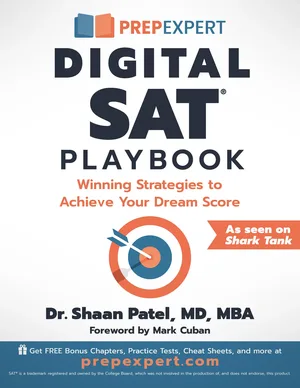
- One page, one offer: Shaan Patel. His story describes a landing page, prepexpert.com/free-book, that offers the paperback free when parents pay shipping, and calls that page a seven-figure earner for Prep Expert on its own. The page has no menu of other choices. The headline is the book, the button is the offer, and the author section sits further down. Pattern: when the action is a sign-up, a single-purpose page beats a full site.
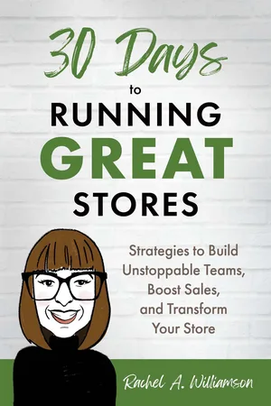
- Client first, book in the menu: Rachel A. Williamson. The home page of runninggreatstores.com opens on the client's problem, inconsistent store performance, with one button to talk about your stores. The book and a shop sit in the navigation. Her story says she sells autographed and personalized copies through that shop, which also gives her customer data Amazon does not share. Pattern: if the book exists to win clients, lead with the client's problem and let the book be the proof.
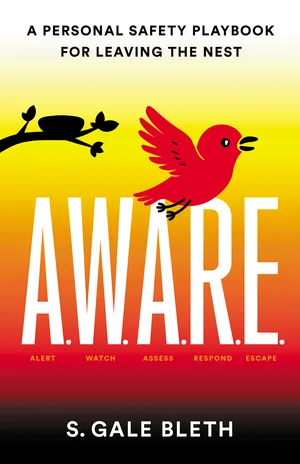
- The named idea as the home page: S. Gale Bleth. stay-aware.com opens with the five words of her framework, Alert, Watch, Assess, Respond, Escape, then lists her credentials and offers a newsletter sign-up and a link to the book. Her story notes she launched a biweekly safety tips newsletter there. Pattern: if your idea has a name, the site can be built around it. See name your idea.
- One site per audience: AJ Crabill. His story points school board readers to effectiveschoolboards.com and restorative practices readers to studentledrp.org. Each site speaks to one audience and has its own way in: find a coach, get the book, subscribe. Pattern: when two books serve two audiences, two focused sites can be clearer than one site trying to serve both.
A worked example
Take Dana Ruiz, the invented nurse manager from the bio guide, author of the invented book Through Year One. Her main action is a speaking or workshop inquiry from a hospital nursing leader. Her current site has a headline that reads "Welcome," a page called "My Story," a blog with four posts from two years ago, and a contact form.
New home page, above the fold: headline "Keep the new graduate nurses you hire." Under it: "For nursing leaders losing new graduates in their first year." Her headshot beside the cover. One button: "Check a workshop date."
Below: three sentences on the cost of losing new nurses, a short explanation of the Ten-Minute Round, two endorsements from nurse executives, and the button again.
Pages: Home, About (first person), Book, Workshops (the Ten-Minute Round workshop and her keynote, each with an inquiry form), Contact. The blog comes down until she has time to write monthly.
Every page now asks one kind of visitor to do one thing, and the words match her bio, her LinkedIn headline and the about the author page in her book.
The teardown checklist
Open your site on a phone and go through each line. Every "no" is a fix.
- Can a stranger say who the site is for after five seconds?
- Is the headline your promise rather than your name or "Welcome"?
- Is there one main button, labelled with what happens next?
- Do your photo and the book cover appear together near the top?
- Do the promise, the reader and your named idea use the exact words from your bio and book?
- Does the book page say who the book is for and link to every format?
- Does the about page use your current first-person bio?
- If you speak, can a planner find talk titles and a speaker sheet in one click?
- If you take clients, can a buyer see how an engagement starts?
- Does the email sign-up say what subscribers get and how often?
- Is there a page or download the book itself points readers to, and does it work?
- Is anything dated and abandoned: an old blog, past events listed as upcoming, a copyright year from years ago?
- Does every link, form and button work, and does someone actually read what the form sends?
- Does the site still make sense on a phone, with nothing cut off at the side?
Then check that the site agrees with every other place you appear, using the consistency checklist. The Scribe Method lists the author website as a place for endorsements, alongside the cover and the Amazon page (read the chapter on blurbs), so put your best two or three there too.
Start with the about page
It is the page visitors open second. The bio builder drafts the first-person version from your facts, in your browser.
Sources: author details from the linked Scribe success stories for Shaan Patel, Rachel A. Williamson, S. Gale Bleth and AJ Crabill; their websites as viewed on October 21, 2026; The Scribe Method, How to get incredible blurbs for your book. Dana Ruiz and her book are invented.