The author photo and the look of your brand.
People decide what they think of you from your photo before they read a word. Here is how to decide what your headshot should signal, brief a photographer, keep the right files, and make the photo, cover and pages look like one person.
The one rule
The Scribe Method chapter on author photos reduces the whole subject to one rule: know what you want to signal to which audience, and then signal it properly. (read the chapter) It is unfair that readers judge an author by a photo, the chapter admits, but they do, quickly and without noticing they are doing it. The useful response is to choose what they will conclude.
That rule connects the photo to everything else in your brand. Your positioning statement already says who your reader is. The photo should look like someone that reader would trust with the problem your promise names.
Decide what to signal, and to whom
Before you book anyone, write two short answers: who is my reader, and what three words do I want them to think when they see me? Then translate the words into choices.
| If you want to signal | Choices that tend to support it | Hypothetical author |
|---|---|---|
| Steady, trustworthy, senior | Classic clothing, plain or office background, soft even light, relaxed but composed expression | A financial planner for retirees |
| Warm, approachable, on your side | Natural light, open smile, softer colors, a setting that feels lived in | A therapist writing for stepparents |
| Hands-on, practical, been there | Work setting (plant floor, kitchen, clinic), clothing you actually work in | An operations consultant for manufacturers |
| Energetic, bold, a challenger | Stronger color, more movement, a direct look at the camera | A founder arguing against conventional advice |
Say you are a financial planner whose readers are physicians early in their careers. Your three words are "sharp, calm, on my side." A dark suit in a wood-paneled office would signal "senior and expensive," which is right for a planner to retirees and wrong for a 34-year-old doctor with student loans. A better fit: a jacket without a tie, a bright modern office or a plain light background, a relaxed half-smile, and a horizontal shot with room beside you for the words of your promise. Same person, same skills, a photo that tells the right reader "this is someone like me, who knows money."
A useful test: put your draft photo next to the photos of three people your reader already trusts. If yours looks like it belongs in a different industry, it is signaling the wrong thing, however flattering it is.
Brief the photographer
The chapter's practical advice is to hire a professional, choose one whose portfolio already matches the look you want, and expect to pay roughly $150 to $500 or more depending on where you live. Then brief them clearly. A good brief fits on one page:
Who I am: [one-line promise].
Who will see these photos: [your reader], on [book jacket, website, speaker sheet, podcast thumbnails, LinkedIn].
Three words I want them to think: [word], [word], [word].
Shots I need: a tight headshot; a waist-up shot with room on one side for text; a horizontal shot for website banners and stage screens; one in a setting connected to my work.
Photos from your portfolio I like: [two or three links].
Clothing: I will bring [two or three outfits].
Files and rights: see below.
The files to ask for
Agree on these before the shoot, in writing. Most problems with author photos are discovered two years later, when a magazine asks for a high-resolution file you do not have.
- Both color and black-and-white versions of your final picks.
- Edited files and the original files.
- Rights to use the photos everywhere you will need them (book, web, print, press, speaking) without further licensing fees.
- If you are doing full-body shots, tight headshots too.
- Vertical and horizontal crops, because the book jacket, the website and a stage screen all need different shapes.
Those first four come straight from The Scribe Method. The last one comes from what happens in practice: the same photo gets cropped into a circle on a podcast page, a square on LinkedIn and a wide banner on an event screen.
On the day
- Clothes: dress for your reader, and wear what you are comfortable in. Comfort shows in your face.
- Background: keep it simple unless the setting reinforces your subject.
- Light: soft, natural light; avoid harsh shadows.
- Expression: match the tone of the book. A thoughtful expression for a serious subject, a real smile for a lighter one.
- Test before you publish: show your top three to people who fit your reader, and ask which person they would call about the problem your book solves.
Photo, cover and pages as one look
Your visual brand is not just the headshot. It is the set of things people see together: the photo, the book cover, your website, your slides and your speaker sheet. They do not need to be identical. They need to look like they belong to the same person.
Let the cover lead
The book cover is usually the most professionally designed thing you own. Take two colors and one typeface from it and use them on your website, slides and speaker sheet. The Scribe Method has a chapter on getting a great book cover.
Use one main photo everywhere
Pick one primary headshot and use it on the book, LinkedIn, your website, every speaker sheet and every podcast. Use the others for variety inside articles and slides. One photo everywhere is what makes people recognize you at an event.
Put the cover next to your face
On your website, speaker sheet and LinkedIn banner, show the book cover beside your photo. The pair says "this person wrote this book" faster than any sentence.
Plan for a series
If you expect to write more than one book, ask your designer how the next cover could sit beside this one.
What Scribe authors learned
Real authors, linked to their stories. These results are strong, not typical, and nobody can promise them.
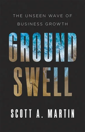
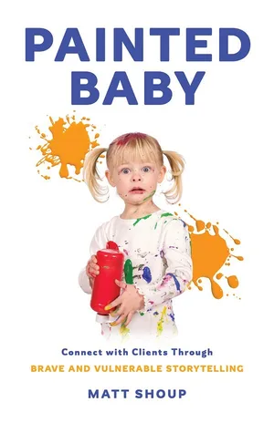

- Scott A. Martin is building a planned four-book series with color-matched covers around Groundswell, so each new book looks like part of the same body of work.
- Matt Shoup learned what a cover is worth the hard way. His first, self-published book had a cover he designed himself, and other authors at speaker conferences would pick it up and ask who did it. A decade later, his speaking agent was waiting for a book that looked right before putting him on bigger stages; Painted Baby was that book. He now uses the cover in his company's marketing brochure.
- Gui Costin made the format part of the brand: his story describes his books at about 65 pages each, thin but full of punch. A short book is easy to hand out at every event, and he makes every event a book signing.
- Deneen Allen was surprised by how beautiful her finished book was, and now uses hardcover author copies in speaking engagements. (read her story)
A visual checklist
- One primary headshot, under three years old, recognizably you
- Color, black-and-white, vertical and horizontal versions on file, with rights in writing
- The same headshot on the book, website, LinkedIn, speaker sheet and podcast profiles
- Two colors and one typeface from the cover used on your website and slides
- The cover shown beside your photo on your website, speaker sheet and LinkedIn banner
- A high-resolution cover image and headshot ready for event hosts and press
Then check the words that go with the pictures in the consistency checklist.
Sources: The Scribe Method, How to take the right author photo; The Scribe Method, How to get a great book cover; author details from the linked Scribe success stories.